magazine 2 page spread layouts
Hey media friends! I have been working very hard on my research for my two page spread, since its the only thing I really have left to do, other than take my pictures. I have thought about doing my two page spread with a couple of pictures, and then writting about the recipes.
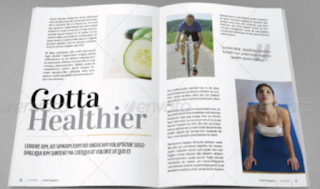
I like this first one because it has a pretty header, I like the font of the words. I feel like if I put a title in big pretty font, it will grab the buyers attention. I like how simple it looks, but since my magazine is winter themed, it going to have red in it, but i can make it redish and then white and light grey, making it more simple and not too much. The second two page spread is also very cool. That one isnt as simple as the first one. It has more reds and blues in contrast to the first one that has grey and white mostly. The second one I can take into thought also because it has a pretty font and heading, and the colors I think can attract the buyer as well. It has multiple pictures and sections, which I dont really want. I prefer more of having one article and then ill talk about how organic foods has changed peoples life, and then I will put 1 or 2 recipes for christmas snacks, and thats all. I dont want my magazine to be over loaded with sections like this second magazine. I do however, like the way its formatted. I think ill end up going with the first one because its simple and cute, and christmas is cute but not simple. That is why im choosing to make the hot chocolate with snowman, to make it look simple and pretty as the front cover, and then on the sinside ill add a little more color to it. I wil keep you guys updated and upload pictures of mine next! xoxo
I like this first one because it has a pretty header, I like the font of the words. I feel like if I put a title in big pretty font, it will grab the buyers attention. I like how simple it looks, but since my magazine is winter themed, it going to have red in it, but i can make it redish and then white and light grey, making it more simple and not too much. The second two page spread is also very cool. That one isnt as simple as the first one. It has more reds and blues in contrast to the first one that has grey and white mostly. The second one I can take into thought also because it has a pretty font and heading, and the colors I think can attract the buyer as well. It has multiple pictures and sections, which I dont really want. I prefer more of having one article and then ill talk about how organic foods has changed peoples life, and then I will put 1 or 2 recipes for christmas snacks, and thats all. I dont want my magazine to be over loaded with sections like this second magazine. I do however, like the way its formatted. I think ill end up going with the first one because its simple and cute, and christmas is cute but not simple. That is why im choosing to make the hot chocolate with snowman, to make it look simple and pretty as the front cover, and then on the sinside ill add a little more color to it. I wil keep you guys updated and upload pictures of mine next! xoxo


Comments
Post a Comment